8
Accessibility or “access” refers to equal access for everyone, regardless of ability or experience. It refers to how organizations recognize and respect each individual’s unique traits and skills. It is all about supporting an equitable environment and making sure that everyone is represented and heard.
The Ontario Human Rights Code (OHRC) uses the same definition of “disability” as the Accessibility for Ontarians with Disabilities Act (AODA), which encompasses both visible and invisible disabilities. Disability, or impairment, affects a large number of Ontarians, and the number of persons with disabilities is growing. Disability now affects 15.5 percent of Ontario’s population, and this percentage is expected to grow as the population ages.
Did you know?
The AODA attempts to detect, eliminate and prevent barriers for individuals with disabilities. The AODA was signed into law on June 13, 2005. It applies to all levels of government in Ontario, organizations and private sector enterprises with one or more employees (full-time, part-time, seasonal or contract).
The AODA comprises standards that all organizations must fulfill and timeframes that are specific to the type and size of an organization. The AODA is divided into five sections, or standards:
- The Information and Communications Standards
- The Employment Standards
- The Transportation Standards
- The Design of Public Spaces Standards
- The Customer Service Standards
In addition, two new AODA standards are being developed:
- The Health Care Standards
- The Education Standards

Under the Ontario Human Rights Code, disability means any physical disability, birth defect, disfigurement, injury or illness. Disabilities can include seen and unseen disabilities such as epilepsy, diabetes, blindness, hearing or speech impediment. Reliance on a service animal, appliance or device is also included in this category.
Disabilities also include mental impairment or disorder, developmental disabilities, dysfunction in understanding and learning. Disabilities that vary in severity include ailments such as arthritis, brain injury or Multiple Sclerosis (MS). These are examples that cause an individual to experience periods when the condition does not have an effect on a daily routine and other periods when it does. It is important to understand that information about a disability is personal and private and must be treated confidentially.

In this chapter you’ll explore
- tools to evaluate course materials for accessibility
- design principles for making your course accessible and easy to understand.
Incorporate course design strategies that meet AODA standards to facilitate accessibility - resources and tools for teachers and students that support accessibility
- accessible strategies in teaching
Accessible Online Courses
Online course planning and programming that ignores the navigational needs of impaired users can create barriers that prevent them from fully participating in learning environments. Because of this, it is critical to approach the online course design with accessibility in mind to offer everyone equal access, the ability to navigate with ease and engage with the information provided in the course.

Make sure your framework is guided by these principles:[1]
Dignity
Provide service in a way that allows the person with a disability to maintain self-respect and the respect of other people.
Independence
A person with a disability is allowed to do things on their own without unnecessary help or interference from others.
Integration
Provide service in a way that allows the person with a disability to benefit from the same services, in the same place, and in the same or similar way as other customers, unless a different way is necessary to enable them to access goods, services or facilities.
Equal opportunity
Provide service to a person with a disability in such a way that they have an equal opportunity to access your goods, services or facilities as what is given to others.

Tips:
- Ensure accessibility of course content and materials by using accessible documents and websites.
- Use captioned videos.
- Select textbooks that offer e-book options.
- Encourage use of software that reads websites and documents (e.g., Read&Write Gold)
The old Chinese proverb shows the importance of the senses in the learning process. The five senses of hearing, touch, sight, taste and smell are the primary means we use to gain new knowledge. We rarely experience it with one sense alone. Our senses work together to give us a total picture of our experiences. People of all ages learn best when involved in meaningful experiences. Learning takes place when the mind is able to put together information from all the senses and make a connection with past learning. Using many senses to gain information helps learning to be more meaningful and useful.[2]
“When I hear, I forget. When I see, I remember. When I do, I understand.”
— Xunzi (340-245 BC)Argued to be translated more like this:
“Hearing is not as good as seeing, seeing is not as good as knowledge, knowing is not as good as acting, and true learning continues until it is put into action.”
Accessibility components include:
- Readability — the ease with which a reader can recognize words, sentences, and paragraphs
- Legibility — an informal measure of how easy it is to distinguish one letter from another in a particular typeface
- Contrast
- Colour
- Language
- Font
- Application of learning through the senses
Website Accessibility
As of 1 January 2014, under the AODA, public sector organizations shall make new internet websites and web content on them conform with the World Wide Web Consortium Web Content Accessibility Guidelines (WCAG) 2.0 to Level A. This requirement will extend to Level AA on all websites by 1 January 2021.
Web accessibility requirements refer to the navigation, design, and coding considerations that help visitors using different types of web-enabled devices and visitors with disabilities use the website. The requirements of WCAG 2.0 provide criteria to assist in making websites perceivable, operable, understandable and robust (“POUR”) for persons with various types of disabilities. These four principles are described in more detail below. When referring to the above paragraph in your own work, consider these requirements within your virtual space and in your written communication. Select the “+” icon for more details.
PowerPoint presentations with speaking notes and alternative text (alt-text) descriptions. Alt-text descriptions are brief written explanations of images that people include in presentations. These descriptions do not appear visually in a presentation. However, if a student reads a copy of the presentation with their screen reader, they can access any alt-text that the presenter has added to images. Writing these descriptions can help teachers plan lessons. While writing alt-text, teachers have the chance to think in advance about
- what elements of an image do they want to draw students’ attention to
- why that image is important to the lesson
Educators can also produce lesson resources that easily adapt to students’ accommodation needs. For instance, materials created in Microsoft Word or another text-based program are easy to print in Braille or read with screen readers. Multiple means of representation help teachers plan and deliver lessons that more students can learn from.
WCAG
What is WCAG?
Web Content Accessibility Guidelines (WCAG) is developed by W3C WAI (The World Wide Web Consortium Web Accessibility Initiative) with a goal of providing a single shared standard for web content accessibility. The WCAG documents explain how to make web content more accessible to people with visual, auditory, physical, speech, cognitive, language, learning, and neurological disabilities.
Criteria
WCAG success criterion 1.4.3 states that visual presentation of text and images of text has a contrast ratio of at least 4.5:1, except for the following:
- Large Text: Large-scale text and images of large-scale text have a contrast ratio of at least 3:1. WCAG defines large text as text that is 18pt and larger, or 14pt and larger if it is bold.
- Incidental: Text or images of text that are part of an inactive user interface component, that are pure decoration, that are not visible to anyone, or that are part of a picture that contains significant other visual content, have no contrast requirement.
- Logotypes: Text that is part of a logo or brand name has no minimum contrast requirement.
Tip: There are a number of colour contrast checking tools that can help you determine compliance.
Best Practices
Below are some best practices for structuring your course with accessibility in mind. Memory can only store so much, so breaks between bites or little challenges to recall info are helpful. Lectures should be between 10 and 30 minutes. This helps with information retention and reduces cognitive load.
Here is an example teaching framework that includes accessibility:
- Consider making an intro video of yourself talking about the course content for that week. A written introduction of the course material for each week is OK for in-person or synchronous classes.
- Be sure to make your presentation (pdf/PowerPoint/spark) available to all students.
- Follow a structure within your work.
- Minimize text when possible.
- Segment information into bite-sized lessons to control the flow of information. This is good for ADD and dyslexia.
- Worksheet design should follow the bite-sized flow of information. You can do this by “chunking” information into clear manageable pieces, to match with teaching chunks.
- Outros, conclusions, or recaps of what was learned at the end of lessons, reminders for what is due, and a look ahead at what will be happening in the next class are all useful.
- Weekly packages for each class will include links, discussions in class for the week, additional help resources (links/tutorials/books/etc.), links to the presentation of the week, and any additional resources needed for the practice of the lesson.
Types of Accessible Formats
Use the dialogue cards below for information about accessible formats.
Accessible Visual Design
Psychology plays a part in accessible course design. Students will retain only bits of the lesson in their memory. Here’s how you can make it a good and memorable experience:
Content
- The typical individual can only hold, on average, seven items in working memory, give or take. It’s important to remember that short-term memory capacity varies depending on the person, past knowledge and context.
- To increase processing, and simple retention of knowledge, divide content into “chunks“ of information. Save the most difficult tasks until the end of the lesson.
Retention
- Because the brain has a limited capacity, it’s preferable to avoid unnecessary material that isn’t directly related to the main purpose.
- Information overload will raise the possibility of a student quitting a task in progress.
- Increase working memory capacity by using both auditory and visual communication methods to convey information.
- Arrange the information in a logical manner.
Visual Design
- A great design triggers a favourable response in the student’s mind by boosting confidence while improving usability.
- Use good design can help users figure out how to engage with a particular piece. (It must be a button if it looks like a button)
- Does it have any significance? The student will look for meaning.
Create Interest
- The gap between what students know and what they need to know might be the required motivation to get them to fill in the learning gaps.
- Attract student’s attention with intriguing titles that pique their interest.
- Reinforce confidence and positivity by using phrases that contain words like “can” or “do.”
- When possible, use symmetrical elements because they represent order, are visually appealing and the human brain looks for it.
Be Memorable
- Include positive notifications when a task is successfully completed.
- Celebrate when a student finishes a crucial task.
- Encourage your students to look for more information.
- To express a point of view, use narrative.
Culture and Design
It’s useful to analyze cultural preferences across major visual design elements. Select the “+” icons below for more details.
Design Principles for Making your Course Accessible and Easy to Understand
Design can sometimes contain a lot of visual beauty, which is why it’s sometimes mistaken for style. However, design is focused on the underlying structure of communication — the concept, not only the aesthetic aspects. This is shown in visual form, which makes it universal. Important things to consider in your course design include
Contrast
Be sure there is enough contrast between backgrounds and text. Use the contrast checker listed in the tools section to evaluate your contrast.
Hierarchy
What do you want the student to see first? Then second? Yes, design directs the movement of the viewer’s eye. Here is a fantastic example of hierarchy in use. Have a quick read.

Source: “Typographic hierarchy” by Andrew Coyle from medium.com
Movement
As stated above, the hierarchy controls where the viewer will look first, second, etc. Ways to direct the eye include contrast, colour and size. Consider the use of these elements appropriately to help direct the students’ eyes to the important information. Remember to maintain a logical reading order for the main body.
Pattern or Repetition
Maintaining, for example, your assignment handouts in a consistent structure or formation, will eliminate guesswork when a student is looking for a particular section; for example, the references. Students will have more time to absorb and understand instructions provided.
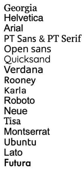
Type or Fonts
All text used needs to be readable and legible. According to vistaprint and Print Peppermint, these are the top readable fonts for online:
Explore
Looking to improve your type? Here’s a three minute video explaining how to use type to improve your design.
Elements & Principles of Design
In this short video, you will learn what the elements and principles of design are and different ways to combine them. Remember, these are things to consider in your visual course design, but not all of them need to be applied at the same time. Happy designing!
Here are some design principles for accessible design in digital space:[3]
Media
- Use descriptive ALT tags for hyperlinks, icons, images, videos and other media types.
- Have subtitles and transcripts for videos. YouTube is a great tool to use for this. (See resources for alternatives.)
- Use images or illustrations for tricky subjects but keep the format similar and avoid surprising your user.
- Avoid unnecessary media that can cause distractions.
Text
- Write descriptive and clear page titles.
- Use periods in your abbreviations (C.I.A. instead of CIA).
- Black text on white background, or the reverse, is the best general practice.
- Write in the active voice (Mike developed the website not The website was developed by Mike).
- Break up large amounts of text into smaller paragraphs or bullet points when possible.
- Avoid making text smaller than 14–16px.
Navigation and Links
- Write descriptive text links that explain exactly what students are clicking on. Not just “click here.”
- Underline your links.
- Make links a contrasting color to your standard text.
- Design for large clickable areas.
- Use breadcrumbs.
Colours
- Avoid bright or loud colours.
- Avoid colour combinations that are known to cause issues for the colourblind.
Assistive Technologies
Activity
At the date this book is published, the minimal requirement is WCAG Level AA.
When to use the contrast checker
- if you are adding text on images
- is your text or background colours are not standard colours (for example, black and white, or cream and charcoal)
If you are not compliant
- contrast checker does allow you to try new background and foreground colour combinations by clicking on the checkerboard of colours
Key Terms & Concepts/ Revisit/ Recap
- AODA standards and compliance
- Accessible Visual Design Techniques
- Accessibility and Access
Disability: See intro — the AODA uses the same definition of disability as the Ontario Human Rights Code.
Accessibility: Accessibility refers to the design of products, devices, services or environments for people who experience disabilities. Ontario has laws to improve accessibility for people with disabilities, including the Accessibility for Ontarians with Disabilities Act (AODA), the Ontario Human Rights Code, and Ontario’s Building Code.
Resources
10 Usability Heuristics for User Interface Design
Speech to text function for Google Chrome.
- Open Google (using Google Chrome) and search “ chrome://flags”.
- Search “live captions”.
- Select “enable”, Then click “Relaunch” at the bottom right (Chrome will exit and relaunch).
- Click the three dots menu for Chrome (upper right corner of browser),
- Click Settings.
- Advanced Menu on the left, then Accessibility.
- Turn on “Live Subtitles”.
You won’t see anything happen when you talk, but if someone else is speaking, you will get subtitles. You can test this by going to any site that has someone else talking.
Colour for accessibility — how to design an accessible colour scheme
Tips on engagement — training in accessible customer service
Tools
Why is colour accessibility important? — Adobe’s Colour Contrast Checker
KeyCastr is a keystroke visualizer, allowing you to easily display your keystrokes while recording screencasts. It is very useful when demonstrating complicated keyboard shortcuts.
A PC alternative to Mac’s Key Castr. This tool is about displaying keyboard shortcuts to users
Some of the features of the program include
- the ability to use the text to speech feature to support reading different materials
- highlighting the ability to extract for note-taking and summary making
- word prediction that looks at English word algorithms to support writing in English
- the Check-it tool provides an explanation when reviewing grammar. It is not just a click-and-fix option; it can aid in English language development.
Another Colour Contrast Checker
RGD’s Practical Handbook on Accessible Design [PDF]
Colour Contrast Checking Tools List
Funkify is an extension for Chrome that helps you experience the web and interfaces through the eyes of users with different abilities and disabilities.
References & Case Studies
Kristy Viers brings awareness to how blind people use tech [Video]
Accessibility for Ontarians with Disabilities Act, 2005, S.O. 2005, c. 11
Clear Print Accessibility Guidelines [PDF]
Accessibility Canada’s Resources
Principles of Accessible Design
- Queen's Printer for Ontario (2021, August 10). How to make customer service accessible. ontario.ca. Retrieved December 17, 2021, from https://www.ontario.ca/page/how-make-customer-service-accessible ↵
- Wortman, R. (1988). Using all the senses to learn. Parent Articles Enhance Parent Involvement in Language Learning. Tucson: Communication Skill Builders.https://www.sd43.bc.ca/District/Departments/LearningServices/SLP%20Resources/Language%20Development%20Disorders/Using%20All%20the%20Senses%20to%20Learn.pdf ↵
- Digital, S. (2019, February 28). 6 principles of accessible design. UX Planet. Retrieved November 30, 2021, from https://uxplanet.org/6-principles-of-accessible-design-79beceeafffb ↵
